


Context
Luckyface Beauty, a beauty tech firm, has decided to focus on KBeauty subscription sheet masks. It had produced a website prototype. It was interesting to learn what their target market thought of the brand thus far.
Design Challenge
Lucky Face Beauty was interested in learning what people thought of the website and where they encountered difficulties and confusion. In order to improve user experience and enable visitors to swiftly and effortlessly do basic operations, the website needed to be redesigned.
Research Process
Participant recruitment
I found 5 women who were friends and colleagues that were the target demographic for Lucky Face Beauty.
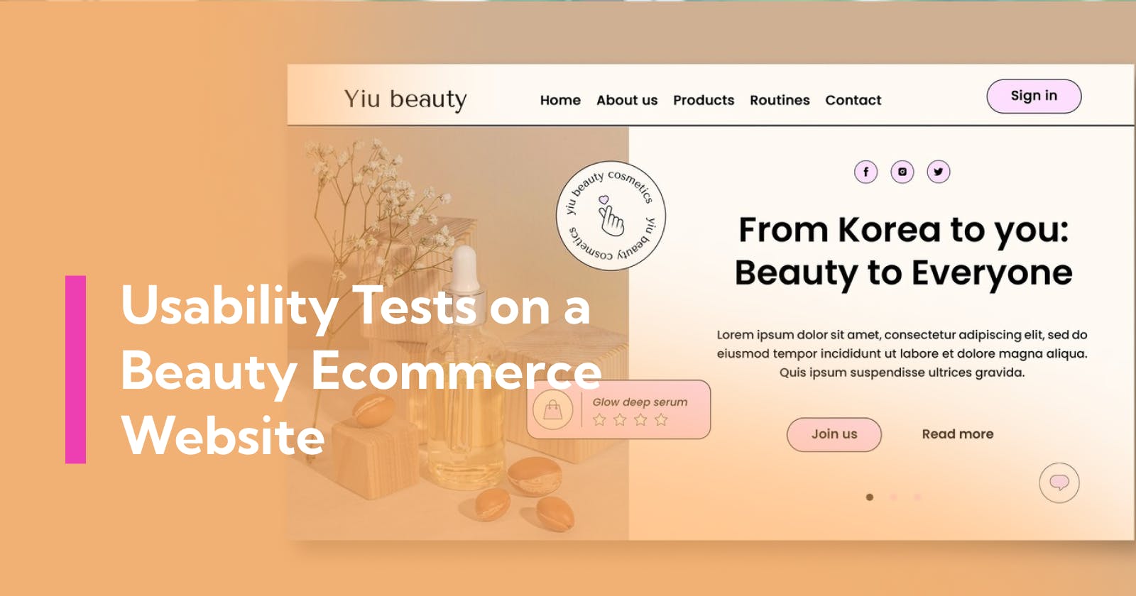
I showed them a prototype of the website, set them 2 tasks and timed how long it took to complete them.
The first task was to figure out what the website was.
The second was to add a product to the checkout and reach payments page
We interviewed them shortly after.
Findings
1) Time taken to figure out what the website is; It took an average of 20 seconds to figure out that it was an e-commerce website selling beauty.
But it took about 40 seconds to figure out that it was KBeauty subscription boxes.
There was also confusion around what’s in the subscription, the price of it and how many boxes it included.
2) Time taken to reach the payment page; From the homepage, it took an average of 1 minute and 30 seconds to find the ‘add to cart’ button, add the product to the basket, fill in their name, and address and reach the payment page.
3) Website lacked important information; They mentioned that they needed to know more about the brand and the products sold. This would inform their purchasing decision.
4) The website lacked a strong value proposition; They wanted to know what was unique about KBeauty and why it was better
5) Website lacked social validation; They talked about how they like seeing social media accounts linked to the website because it shows the product being used by others and gives them helpful tips to get more out of their product.
6) The logo was not prominent enough; Users found it hard to see the logo. They struggled to find it and wanted it to be bigger.
Actions
1) Add a snappy intro; This helps users understand the website in as short time as possible
2) Add a clear value proposition; This helps users find out what makes KBeauty unique.
3) Provide more brand and product information; This helps users understand more about the ingredients, benefits and why they should subscribe.
4) Add more information about the company; This helps the user understand what the company’s aims are and builds a relationship with the user.
5) Add a social media feed to the website
6) Make the logo more prominent; By increasing the size of the logo and adding a rectangle around it, users could see it more clearly. This helps users go back to the homepage and with brand recognition.
Results of the second usability test
After the redesign of the website, I invited 5 new users who had never seen the website to do the same usability tests. There was a good improvement in how fast it took to complete the tasks.
Users took 8 seconds to figure out that they were on a beauty e-commerce website. This was 60% faster than before.
Users took 25 seconds to figure out that it was a KBeauty subscription service. This was 38% faster than before.
Users took 63 seconds to add a product to the shopping cart and reach the payment page. This was 65% faster than before.
Conclusion
The usability tests made a huge difference in the UX of the website.